Deleted
Deleted Member
Posts: 0
|
Post by Deleted on Mar 1, 2017 13:07:44 GMT -5
Panel 22 of the Takekurabe Soshi. Most panels of this scroll portray two poets facing each other, and their competing poetry. Some text-only panels are included, however, and some with full-panel illustrations like the above. |
|
Deleted
Deleted Member
Posts: 0
|
Post by Deleted on Mar 1, 2017 13:11:26 GMT -5
Your drawing skills are getting better and better! Still tracing, actually. I just have a better light box and smoother brushwork. Better brush, too. There's this fine brush from Kuretake that I think is made from the fur of an endangered weasel or something, but it's just terrific for getting those sharp outlines. |
|
Saionji Shonagon
New Member
 One dreamed of becoming somebody. Another remained awake and became. (Found in a fortune cookie.)
Posts: 7,240
|
Post by Saionji Shonagon on Mar 1, 2017 13:40:45 GMT -5
|
|
|
|
Post by solveig on Mar 1, 2017 18:05:27 GMT -5
Noble Cousins!
Greetings from Sólveig! My experience with both calligraphy classes and witnessing what designated calligraphers can do in company offices and city halls impels me to be rather a wet blanked about using fine brushes. Those fine point brushes are used for doing things like writing 10pt kanji freehand. Ordinary illustration and calligraphy on shikishi, hanshi, &c. is done with much larger brushes. You should see the things my calligraphy teacher could do with a #3 or #5 brush of the sort that I lend to students at my calligraphy "classes" at Pennsic. Incidentally, those are numbers for Japanese bamboo brushes, not things from Windsor Newton or some other place.
Regardless, I very much enjoy the efforts to reproduce the sort of art passed down to us from the Nara and Heian periods. I just hope that people will practice with larger brushes as well. Proficiency at Japanese scribal arts is far from being an overnight affair.
About Japanese paper. While you may be able to find relatively inexpensive paper which includes kozo at a local art supply store, there are grades to this stuff. Hand laid 100% kozo paper can be rather expensive. For example, a 500 x 700 mm sheet of Kurotani #6 hand laid 100% kozo costs £19.50 at Shepherds Fine Paper. This paper weighs in at 100g/sm. I prefer Kurotani #5, but am having difficulty obtaining it these days. Regardless, Japanese paper should have a front and a back side. The front side is smoother than the back. Certain really crappy paper has sort of a waxy smooth side. You should write on the back of such paper. Actually, you should try to avoid purchasing it in the first place. My calligraphy teacher was also rather choosy about 墨汁 bokujui. The bokuju I showed up with at my first class was judged totally unacceptable.
|
|
Deleted
Deleted Member
Posts: 0
|
Post by Deleted on Mar 6, 2017 11:12:04 GMT -5
Suh-weet! Did you use ink, or paint? When I did my bunny banner, I used paint because I wasn't confident enough about ink. |
|
Saionji Shonagon
New Member
One dreamed of becoming somebody. Another remained awake and became. (Found in a fortune cookie.)
Posts: 7,240
|
Post by Saionji Shonagon on Mar 6, 2017 11:36:15 GMT -5
I used one of the calligraphy brush pens I bought in Nara. Sadly, this so-called rip-stop nylon isn't. The ribs are working through the silk at the top and I had to do a quick fix with white duct tape this weekend. I won't have time for a rebuild until after Gulf Wars, so it's back to the stuff I get from the kite building supply place.
|
|
Deleted
Deleted Member
Posts: 0
|
Post by Deleted on Mar 6, 2017 12:47:47 GMT -5
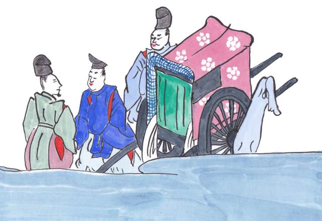
Here's another copy of an earlier copied image from panel 9 of the Takekurabe Soshi. I like to do at least two copies of everything. I'll donate the one that comes out better to the Barony or Kingdom for use as a scroll blank, and keep one in my library so that I have an emergency stash and portfolio. In this one, I tried to more exactly copy the original image, decorating the curtains as they were and such. I think this one came out a little better than the first one, but the first one has comets and escarbuncles on it, so the first will make a better scroll blank. |
|
Deleted
Deleted Member
Posts: 0
|
Post by Deleted on Mar 6, 2017 13:05:20 GMT -5
The image from my previous post is actually only half of panel 9. The lady is competing poetically with a placid gentleman. Both of these, in my opinion, have some problems, mostly to do with the coloring, and the edging on the tatami. |
|
Deleted
Deleted Member
Posts: 0
|
Post by Deleted on Mar 6, 2017 13:24:55 GMT -5
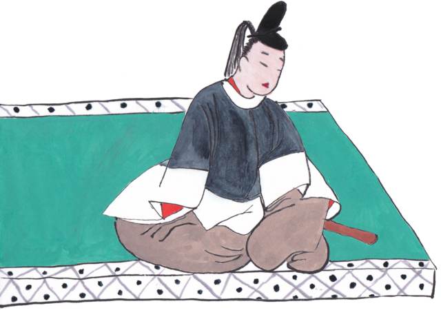
Nijou Tameshige is credited with one 36 Immortal Poets list from the late 14th century, of which only individual fragments exist. This image of the poet Kiyohara Motosuke is from that version, though some analysts have their doubts about attributing it to Tameshige. Some analysts place it up to 100 years later. I love the expressive nature of this original art. The original even has some pale coloration, which I didn't know was allowed for hakubyo art. |
|
Deleted
Deleted Member
Posts: 0
|
Post by Deleted on Feb 27, 2018 9:04:48 GMT -5
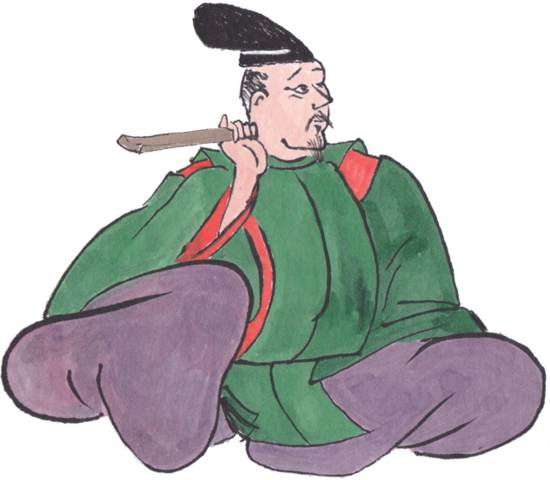
More Choju Giga from "scroll A" - I like this image, as it shows devotion to an ideal, as well as quiet support for the work of others. |
|
Saionji Shonagon
New Member
One dreamed of becoming somebody. Another remained awake and became. (Found in a fortune cookie.)
Posts: 7,240
|
Post by Saionji Shonagon on Feb 27, 2018 18:05:36 GMT -5
|
|
Deleted
Deleted Member
Posts: 0
|
Post by Deleted on Feb 28, 2018 20:11:11 GMT -5
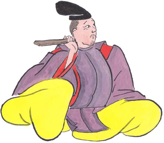
You know I love the Choju Giga! Check out this recent iteration of my fighting fan. 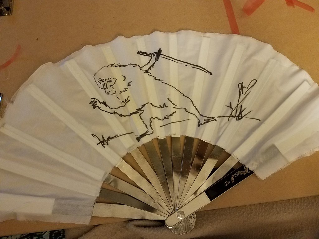 Expressive and intimidating. 10/10, would prefer to not face in battle.  |
|